
What is most important for each interior design project is the family for which this project is carried out and the context in everything. The house that we will present in this article was organized for a young family, with a child, who wanted a functional kitchen, with sufficient storage spaces, an airy and minimalist living living area, the bedrooms without simple but elegant furniture and bathrooms. In this context, the final result is a special agreement for functionality and amplified for furniture and some accent colors.

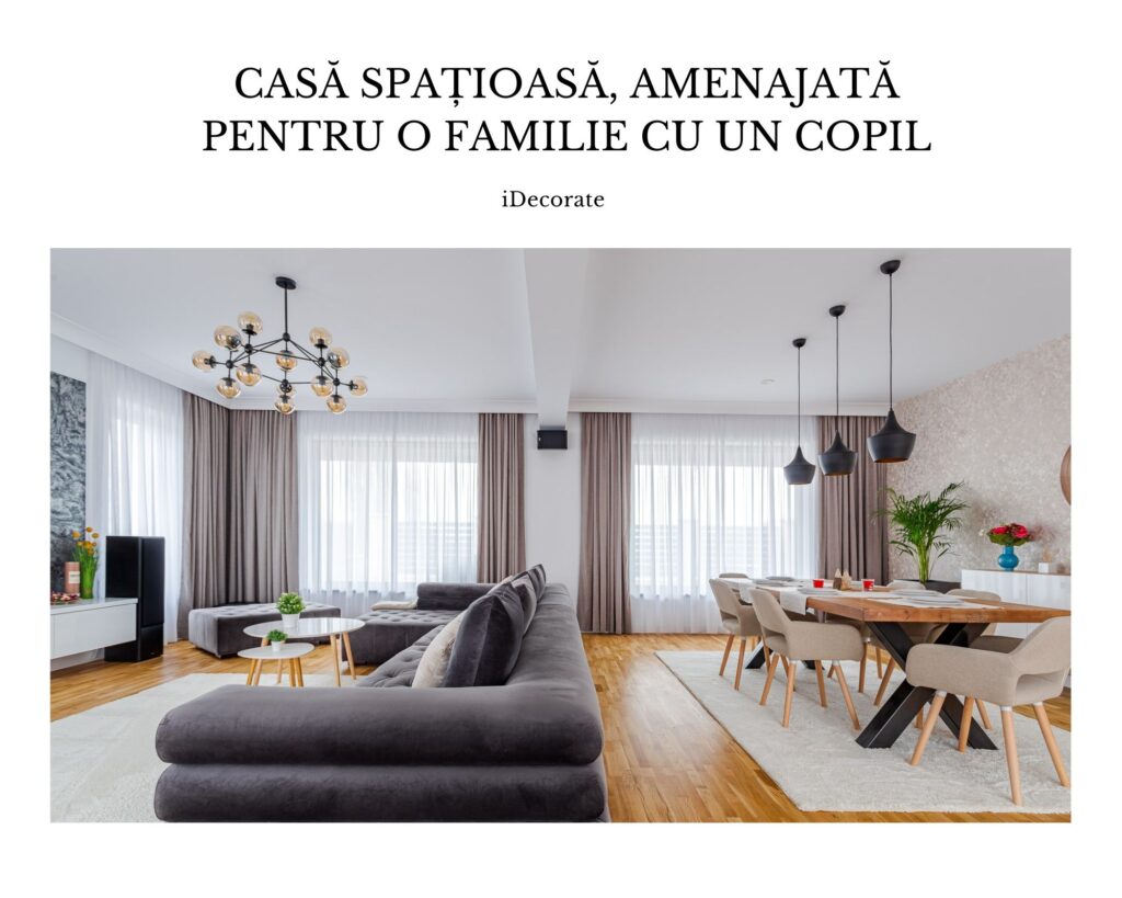
The entrance to the house coincides with the living area, where the functions (life, the dining area, the kitchen) communicate openly. In order for the space to be ordered but to surprise visually, I chose the unitary finishes: light parquet and white walls and for furniture I opted for gray and beige tones, combined with black (kitchen).
Food It is organized in the form of L with personalized furniture. The window area has been left free for light to flood the space and opaque black furniture (similar to glass carpentry) offer the feeling of ordered and airy space.

For an orderly appearance, the kitchen furniture were designed with ground handles. The work area is extended by the island and this function of the kitchen offers minimum visibility to and the living room on the work surface. All appliances are incorporated into the furniture and for the wall in the area of the work surface I opted for the gray finishes to connect with the dining room and the living room. The equipment in the kitchen offer an industrial aspect to space.

The entire ground floor of the house is organized unitary, in beige and gray tones, which are found both in the set of decorations and in the furniture. The entire space is exploited to maximum capacity: I integrated a generous sofa and a mass of six people on the ground floor. The TV was placed on the wall between the windows, so that there is visibility from all areas of the living space. For a dynamic effect, the wall behind the TV was finished with a decorative background with gray tones. The yellow armchair, the table, the convenient in the television area and the comfortable area in the dining room completes the entire space.

The double bedroom It is currently organized, simple and minimalist. The plates behind the bed and the contrast between the two walls on the left and the right of the bed bring an extra refinement in the bedroom and leave the feeling of rest, welcoming and airy space. The mirrors applied to wooden seals offer depth to the space and increase it visually. The bed in the double bedroom has a simple and current shape, padded for extra comfort. At the level of the floor, the carpet is asymmetrical in relation to the riteds behind the bed, but symmetrically with the gray wall.

For Child’s room I took into account the baby’s age and concerns and adapted the palette and chromatic functions. Therefore, the child’s room is flooded with white, blue and pale pink. The functional arrangement is also present here, the room is divided into the rest area and in the game/ study area. The rest area consists of the Montesori blue bed and the wall behind it is decorated with plywood that imitates the clouds. The game/ study area consists of a chair table and the shelves on this wall have the role of maintaining order. The wardrobes were chosen to cover the entire wall next to the door and all the furniture in the room were made so that the center of the room remained as free as possible.

The guest room he was simply organized, in tones of
blue. The wall behind the bed and the carpet provide dynamism and depth to space. And here the bed has a coating for greater comfort.

The three bathrooms They are arranged in tune with the rest of the house. For greater elegance, for the first bathroom I chose a ceramic tile in a dark gray and for an orderly and timeless appearance, the furniture chosen are in the same shade as the walls.

The second bathroom is also elegantly treated, thanks to the marble similar finishes. For a dynamic effect, for the wall in the shower area and for the one behind the mirror I chose a mosaic plating.

The third bathroom is minimalist, with ceramic tiles in shades of gray and beige, mosaic wall, bathtub and independent sink. For storage we chose to disturb a wardrobe in the wall above the toilet.

The resulting environment is functional, harmonious and welcoming and will undoubtedly resist the furniture, health services and excellent quality finishes.
Source images: ditted